Thursday, 20 March 2014

Experimentation - Illustration


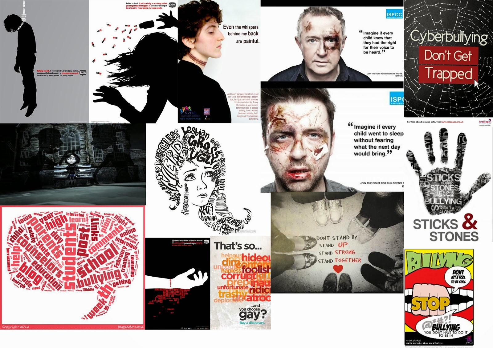
Previously I have looked at anti bullying campaigns. One which grabbed my attention was the one on the left. I have decided to try and re-create this in my own way and have used words which I highlighted in my previous research about Dairy Entries from Victims of Bullying. I like how simply this image is and I want to try and create something similar to this.
However, I want to focus on the words replacing the noose therefore I am going to try and take a upclose shot of someone with their head in a similar position.


Photograph -> Illustration


To begin with I took a photograph of a girl in a position which I thought reflected someone who was hanging. I focused on the upper body. I then took the photograph into illustrator drew around it adding detail in. I then took it into Photoshop and coloured in the silhouette with black and cropped it down. I then added words, warping the text around her neck so it looked realistic.

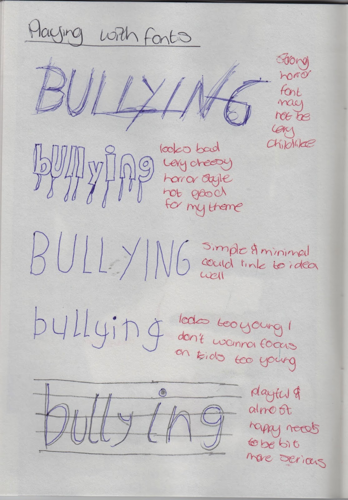
I feel this is a good simple image however it is not very powerful. I want to convey strong emotion and make my work evoke a response from viewers to try and show them the danger of bullying. Therefore I feel this isn't successful. I could work more with font experiment with how different fonts can help emphasise different emotions and then possibly develop the idea further by working with text. Below is a quick sketch I conducted working with different fonts.


Tuesday, 18 March 2014

Experimentation - Animation

Looking at To This Day I feel incredibly emotional as the way in which the animation is made is, I feel, beautiful. Looking at the Diaries of a Bullying Victim I have created a storyboard which I will follow when I go through this animation.

Storyboard


Story

Below I have wrote a story version of this using the original dairy as a base but making it my own words. I will have someone saying these words over the top of the animation.

I am so happy today. It's my birthday and I got all A's on my report. Its the best day ever.
I walked to school today and these boys called me a Sissy. Why me? I hope they don't do it again.
They keep calling me names. I feel so lonely. I hate school.
I pretended I was ill today. I stuck my fingers down my throat and threw up. I don't want to go to school.
I went online today and saw on a forum someone wrote that I should run away.
They were passing notes around in class. They wrote on it that I was a loser. That I should end it all.
I gave them what they wanted.

Animation

I wanted to create something which could be similar to To This Day and I worked with Photoshop to create this short animation. In case the embed doesn't work click this link: http://vimeo.com/89422406


bullying story from Amy Taylor on Vimeo.

I drew on separate layers each part of the animation and then collated them into folders and placed them in the timeline turning them into stop motion clips. Next I recorded a boy speaking the story I wrote earlier. I then merged all these aspects together to create the animation.

From this I found creating an animation was an incredibly good way of showing the growth of bullying and how it can change a persons feelings about the world around them. The use of images relating to the story rather than using a person going through these feelings. I found it was something different and something I may look into in future. The use of basic colours and simple drawings reflect a young age and that the person the story is about is a young age. Mirrored by the hand written note on the final scene. 


Monday, 17 March 2014

Experimentation - Chemical Photography


I found another anti bullying poster influential. I have shown this on the left. I thought that the simplicity of this image was good. I thought I could re-create it using photograms.
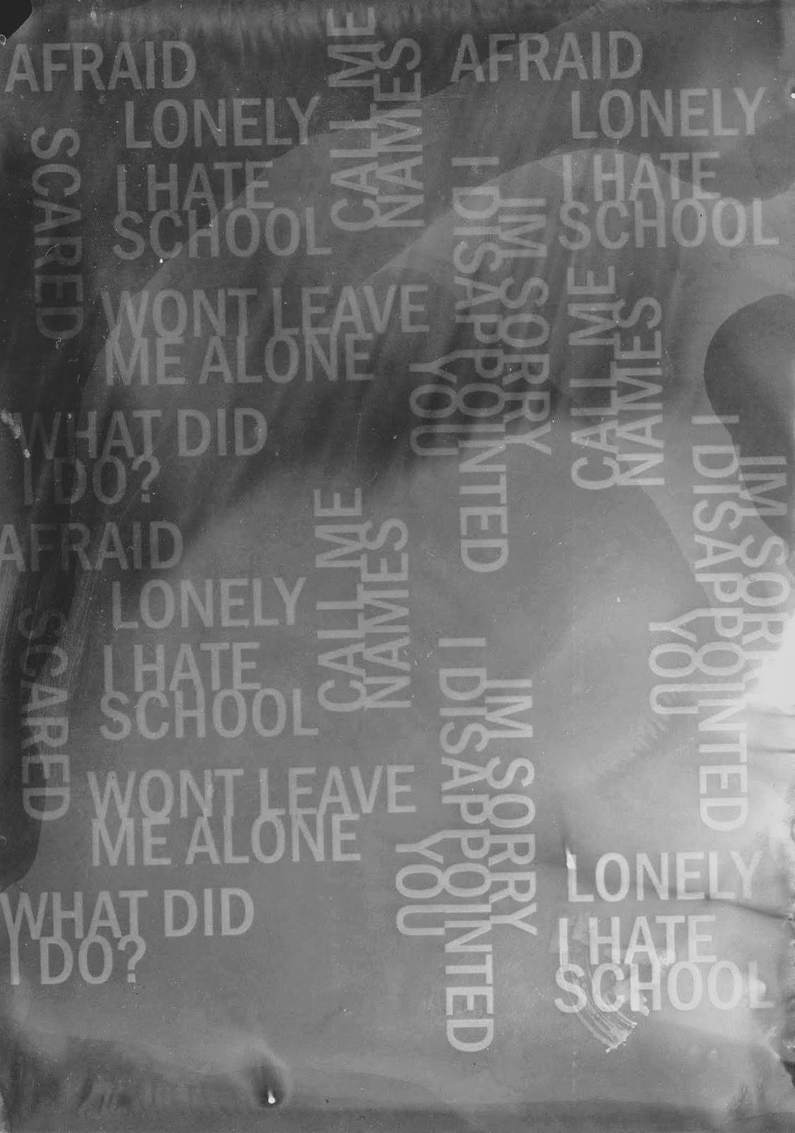
In order for this to work I thought I could create a wordle document displaying a variety of words which explain the way to victim feels. I then will print this onto acetate and then turn it into another photogram. I will do a additionally photogram which is just of my hand then in Photoshop I will overlay them.


I pinpointed certain words and phrases from the Dairies of a Bully Victim which stood out to me to display the feelings of a victim of bullying. I printed this onto to acetate ready to take into the dark room.


Photograms

This first photogram I placed the words upside down and onto the photo emulation paper. I then placed glass over the top to hold it all down and then shone the light on it for 5 seconds.
I found this was very grey and I wanted it to contrast well I wanted the words to be white and the rest to be black. Therefore this one wasn't usable for my idea. However, I did learn that I needed to changed the developer to try and get a darker image so changed that a tried again.


This was the better image as the developer was newer and I left it under the light for 4 seconds. The colour of the words didn't contrast as much as I hoped however, I feel in Photoshop I can alter this. Also I changed the side of the words so it was readable.
Below is the Photoshoped image:


Both of these hands were good. However the right one has more white marks init where the hand was pressed down firmer on the photopaper. Therefore when I overlay the two images it may work better for this photogram. However, they are both very similar so I want to try overlaying with both images.


From the above photograms I found the second one is better. However, it's not very emotional I feel there should be some colour added in to give it more emotion. The first one (on the left) is plain and very simple. There isn't a lot of contrasts within the image and this make sit dull. The words don't stand out enough which I don't like. I could work with the second one by adding colour to the words through overlaying paintbrushes. 

To enhance this image I overlaid a blue gradient as I feel blue is an important colour as it represents water and therefore tears. I feel the colour blue can emit emotions of sadness and I want to try and manipulate the viewers of my work to see it as emotional and sad. However, I feel this is not as emotional and as interesting as the work I want to produce. I don't feel this media is the most appropriate for my own ideas however I could look further into the use of words and how words can play a role in bullying. The power of words as well is good and the development of colours can mirror how bullying can develop overtime. I could look into working with colours and the power of colours. Below is a colour chart which I made based on this idea using bright colours developing to dark:


Sunday, 16 March 2014

Dairy Entries of a Bully Victim

From my What Next? Brainstorms I found to produce more emotional work I needed to look at case studies of victims of bullying so I could understand more clearly the effect bullying has. Also some of my ideas from my What Next? Brainstorms link to the idea of words and telling a story on someones hands and using projections to show the story. One study which I found online I found to be truly horrific. Many people forget that bullying can happen to boys and this story below is about a boy who was bullied and it shows the growth bullying has on a person and how they can change. This story took place over 5 months. It is a fictional story, therefore I feel I can draw ideas off of it without risking offending family members. However, the feelings expressed within this story is very true. I have included sections of the story but the full story can be read on:  http://ezinearticles.com/?Victims-of-Bullycide-Stories---Joshuas-Diary&id=4609549


November 5
This is the best day of my life!
I just got my report card and got an A in all subjects.
I am so happy!
November 22
I do not understand. Billy and Joel started calling me a sissy. I never did anything to them. Why are they calling me names? They wouldn't stop. I hope they do not call me names anymore.
December 3
Billy and Joel are still calling me names. Now they are calling me the P word. They say no girl would ever go out with me. They say I am a loser.
Now even Jessica and Scott are calling me names. My best friend Marcus says he is afraid to hang out with me. He is scared they will start picking on him.
December 15
They will not stop. I told them to stop and they pushed me against the lockers in gym. Then they started making fun of me in the showers. It was great when Mr. Holland walked in and told them to break it up. I am scared. I hate school.
I want to tell Mom and Dad but if I do they will talk to my teacher and when Billy and the others find out I told on them I think it will get even worse.
January 2
Christmas vacation was fun. 
I wish I did not have to go back to school tomorrow.
January 3
I knew I did not want to go to school. Billy and his gang started calling me names again and then shoved me back and forth making me fall down. They took my lunch money and dared me to tell.
January 12
I pretended I had an upset stomach. Mom would not stop asking me questions. She wants to know why I am so sad all the time. She says I have changed.
I could not tell her. I am afraid to.
February 15
I knew things would not change. Now the gang just makes sure no one else is around when they pick on me. I am scared to go to the bathroom, locker room, showers, any place they can corner me in private.
I am so tired. I am so lonely.
March 2
Report cards came out today. It was my worse report card ever. Mom and Dad said it was alright. That they understood. I could tell I let them down. They were disappointed in me. I can tell.
March 11
What I found was some messages from a guy called George. He was calling me all kinds of bad names. He said I should just run away, leave, not go back to school. That no one liked me. That no one wanted anything to do with me. Maybe he is right. I think it is Billy. It sounded just like him.
March 12
I put my finger down my throat this morning after eating a big breakfast and threw up in the bathroom. I showed Mom and although I suspect she knew what was going on she let me stay home. I did not want to go to school. I am scared.
I found more really bad posts from George or whoever. Now I am also getting posts from someone with a screen name of Devil880 and another whose screen name is Chuckie69. I did not think they allowed that kind of language on the forum. I am not sure I want to report it. It might just get worse.
I don't think I am going to come back to the forum any more. It just isn't fun anymore.
March 21
Something is going on. It seems like everyone I look at is laughing at me. I see some kids passing a piece of paper around and then the person giggles and looks at me. What is happening?
More posts telling me I am a loser, that I should just end it all now.
I cannot take much more. What are they going to do next?
Why won't they just leave me alone? What did I do to deserve this?
I can't go back to school. I know Mom is going to make me go.
This is the worst day of my life!
Conclusion of The Diary of Joshua - Victims of Bullycide Stories:
That was the last entry in Joshua's Diary.
You could see water marks on the last page Joshua wrote. I am sure he was crying as he was writing. He must have been very sad, lonely, and confused.
Joshua's Mom, after calling him from downstairs several times to come down for breakfast, went into his bedroom. She did not see Joshua. It was too cold for his window to be open. Why would it be open? Then she saw a thin long nylon rope tied to his bedpost near the window. When she looked out the window she found her son. He had hung himself.
On his nightstand was a note. It simply said "I am sorry I disappointed you, I love you Mom and Dad, Joshua".

Article Source: http://EzineArticles.com/4609549

Thursday, 13 March 2014

What Next?

My work is truly about the effects of bullying. I feel incredibly passionate about this idea. The concept that one human being can go out of their way to hurt both emotionally and physically another human beings life baffles me. How bullies think so little about the impact they have on their victims makes it even more tragic. I wanted to try and explore the impact bullying has on the victim how they can feel trapped behind the words and bruises and how dark it can make their lives. I used a single model and dark lighting in an attempt to replicate this and explore the effects bullying has on the victim. However, I want my work to be emotional. I feel so passionate about this subject and am strongly against the idea of bullying. When I hear horror stories in the news about young people who have been so badly bullied that it leads them to suicide fills me with anger. I want my work to stand out and make a difference. I see so many anti-bullying campaigns and these are incredibly powerful the way in which a photographer works to try and send out a message to many young people about this idea in such a bold way. I feel anti-bullying photography is even more beautiful when it is done in a minimalistic way. The lack of staged settings and the simplicity of using just a girl in a room emits more emotions than a overpowered and overdone photograph. 
Inspirational Works:

YouTube Video
This YouTube video explores the idea of anti-bullying and features an incredibly influential and powerful speech behind it:


AntiBullying Campaigns


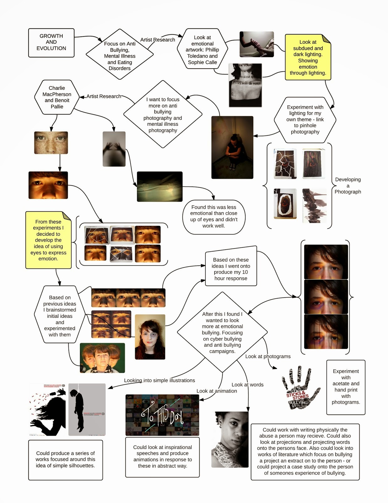
Development FlowChart


Advanced Brainstorm


Sunday, 9 March 2014

Responding to Idea of Bullying


I have done a lot of research into my ideas about growth and evolution and now its time to show a initial response to this exam title.
Taking into account the work I have previously done I felt my anti-bullying piece based on the work of Benoit Paille was the best. It was incredibly emotional and I feel I could further with it to create a good final piece.

Brainstorming Ideas


Idea 1

My first idea is to take an up-close photograph of a set of eyes and within each set of eyes display a different form of bullying. 
Below is this response, I have done it quickly as it is just an experiment and if I chose to carry on with this idea I will need to take better photographs and spend more time planning lighting and staging. 


This series of three photographs I feel is quite powerful. The third one which displays cyber bullying I feel is the best as the use of screen and opacity and the blur of the original photograph meant it looked like a reflection in her eyes. I like the idea and I could work with this more. Possibly the fist could be coming towards the eye and could be half in one eye and half in the other this could show the reflection. With the words I could physically write them, photograph it and show it as a reflection in her eyes.

I edited these slightly further as I wanted to make them look more editorial so airbrushed the skin more and removed the reflection of the light in her eyes.


Idea 2

A up close close shot of eyes in each shot it shows how bullying affects a person - words covering them, being ripped up, screwed up and being covered in water.
Below is this response. If I do this as a final idea I will present it as four separate images so I have done this below. I have used a photograph which I have edited previously and experimented with already. If I do this idea I will re-shoot the photographs.


When I placed water over the photograph it made no difference, therefore to develop this I placed some blue paint over it to look like tears. I feel the blue paint idea worked very well. It made her look far more vulnerable and sad than before. I want to use this idea and experiment with it further. I also like the other ideas. Having the rips across the face could mirror the scars people feel from bullying. 

Idea 3

A 'beauty' shot of someone, both in the same position. One photograph has her looking beautiful, the other has words and bruises covering her face. The middle is ripped in half displaying this evil side.
Looking back on this initial idea I decided I didn't like it that much and wanted to change it slightly. Rather than having two separate photographs I will put make-up on half the models face but not on the other to show the impact of bullying and how she is trying to cover it up. I will also focus more on physical bullying using bruising rather than words. 


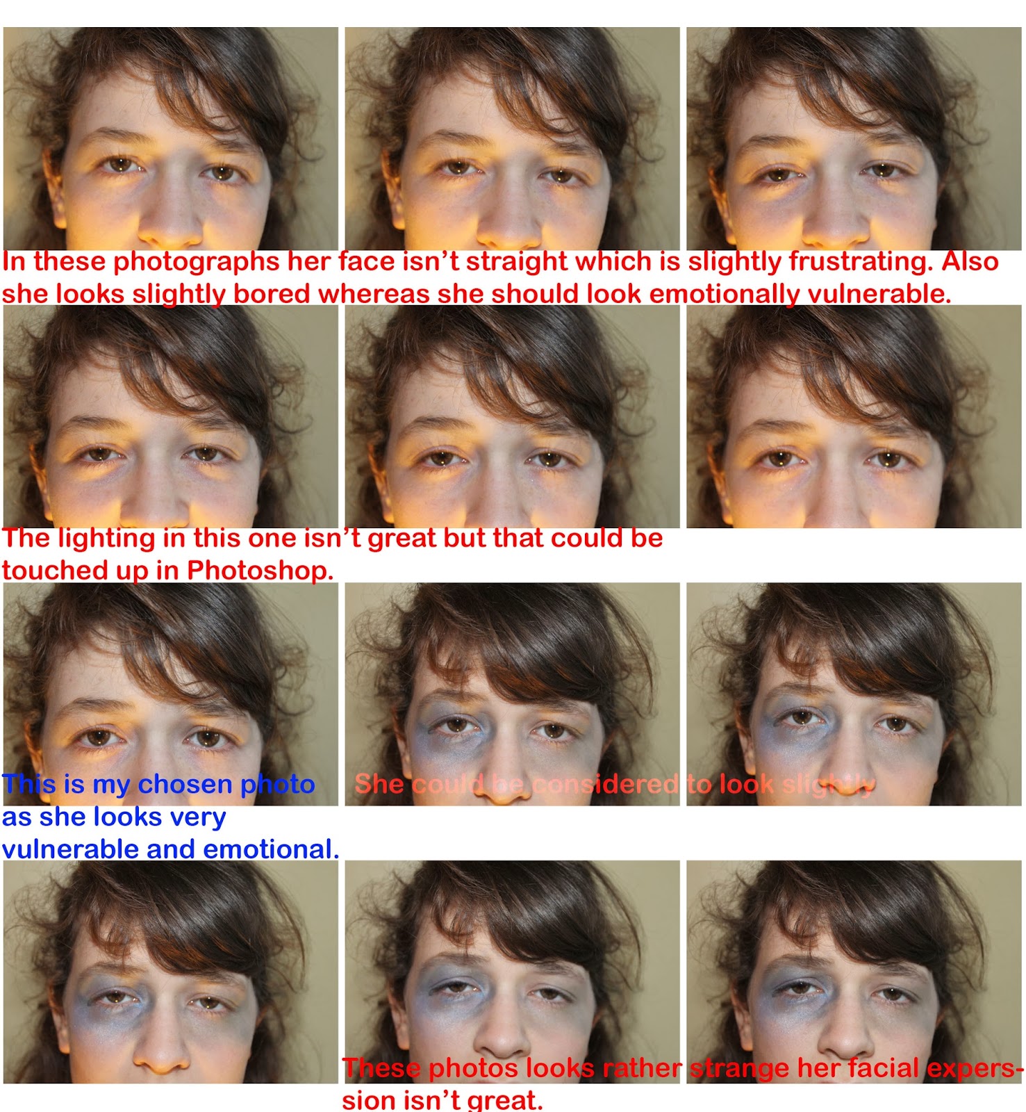
I do like this photograph as it shows both sides to bullying in a interesting way. My main issue however, is the models facial expression. She looks almost bored and very neutral. I feel maybe I should have done two photographs as I could of shown her smiling in one and maybe crying in the other. Yet the use of make-up to create bruising is interesting. I could further this within my final piece. Also combining airbrushing and making her look pale using a lot more white shows how she is trying desperately to hide her bruises and her pain. 

Idea 4

Shot of someone looking sad, then two of them screaming and merge together showing a motion style photograph.
Below is this response. I did it roughly and many more things need to be considered if I was to take this further, for example for lighting and setting.


I like the concept behind this idea but feel it links better with my ideas about mental illness than bullying. I could however, develop it to link to bullying but putting other people either side of her and make them look mean as if they are bullying her possibly verbally. 

Final Idea

From all this experimentation I have decided on my final idea for my first response within the context of 'Growth and Evolution'.
I am planning on doing a series of photographs showing the progression of bullying through physical punching. From my initial experimentation I found Benoit Paille up close photography to be very interesting and I wanted to twist this into my own ideas. I have experimented with creating a series of photographs showing different effects of bullying. However, this doesn't link very well to growth and evolution. I want to show the growth of bullying and how it can affect a person. Therefore, using the pervious experiment with bruising on the face and creating a development. I am planning on taking a up close photograph of eyes and will show the girl to have a sad face then the second photograph will have more bruising and the last to have more and then less and less. Below I have roughly sketched this idea to try and show how it will work:

Sketch of Idea


Contact Sheets


Editing Process

Image One
This was my first image in the series. I started editing it by using simply editing techniques. To illuminate the face more I adjusted the levels and curves. Then linking back to my original experiments in response to Benoit Paille I overlaid a Gaussian blur effect to make the face airbrushed. Next I needed to make the image slightly more dramatic. I plan on doing this by working with overlays and gradients.
I overlaid a black - nothing gradient with a soft light to try and make her look more trapped. Below is the final image:


Image Two

This image was to show the progression of bullying and how it can lead to physically being hurt. I have given the model a harsh bruise around one eye and a older bruise around the other to show it's something on going. I added a airbrush affect to this image and altered the levels and curves to enhance the lighting. I then created a new layer with a very low opacity and draw using different shades of blue and yellow enhancing the colour of the bruises. I then needed to add some darkness to the image so copied the gradient steps I had taken with the above photograph to do this.

Image Three

For this image I was going to take similar steps as I had with the other two to produce it. However, I worked more with enhancing the bars over the eyes as they were the main part.


Final Photographs


Looking back at these photographs I found I wasn't entirely happy with them, I wanted them to all look the same and I found they didn't really. Therefore to experiment a bit more I took the first image which I was very happy with and added fake bruising using colours and very low opacities in Photoshop.

Below are my NEW FINAL PHOTOGRAPHS


Evaluation

My work is about the growth of bullying and how bullying can evolve from something small to a victim feeling trapped within themselves. I produce the photograph using dark lighting and edited it to emphasise this. I then used clever Photoshop to create  bruising around the eye using a combination of colours and overlays as well as low opacities. They are a series of three photographs aiming to display to growth of bullying from how it can make someone feel, to how it can physically hurt to how they feel trapped from everyone. I used a 17 year old but using airbrushing and by making her look vulnerable it changes her age to make her look younger and more innocent. She is looking directly at the camera to try and contact the viewer and communicate how she feels. This way it evokes a dark mood showing a darkness within her due to the bullying. 

My idea has developed from my initial thoughts about emotional photography and producing work which evokes powerful emotions from the viewer. However, I needed a subject mater which was emotional and I wanted it to be significant to me. Initially I thought about eating disorders as I feel the concept of a young girl/boy who feels they are never good enough and stop eating to be tragic. Then I went onto thing about mental illness as I watched some TV programmes and studied abnormality within psychology and found the way people treat those with a mental illness heartbreaking. They are shut out of society because we don't deem them 'normal'. Yet, I chose the concept of bullying. This was mainly because I heard about tragic bullying stories in the news and felt like I could include elements of mental illness and eating disorders within this wider concept. 

From this I want to go onto produce photography similar to this. I want to focus slightly more on bullying. I need to ensure I have more empathy behind the images and make people feel compassion towards them so they want to change bullying and help stop it. A good place to look would be anti bullying campaigns as they aim to cut out bullying and stop it all together. I also think I need to study bullying in more detail. When you think about bullying you think about the obvious things, however, to communicate more meaning behind my work I feel it would be a good idea to look more at case studies of people who have been bullied to understand how they feel and the emotions they felt when being bullied. I quite like the idea of following the line of cyber bullying. I feel this could be very interesting as people are powerless towards cyber bullying and they can't do anything about it. Cyber bullying, in my opinion, is more emotional than physical bullying as words can hurt sometimes more than bruises. Bruises can heal but words will remain in your mind forever. 

Wednesday, 5 March 2014

Developing the Line of Enquiry


Soon I will be embarking on my exam time and before hand I want to ensure I have a good idea of what I want to do. Previously I have looked at artwork involving mental illness, eating disorders and bullying. Within these ideas I have explored experimental photography and emotional photography. I know need to start creating a more direct idea.

Brainvomit


Visual Mood Board


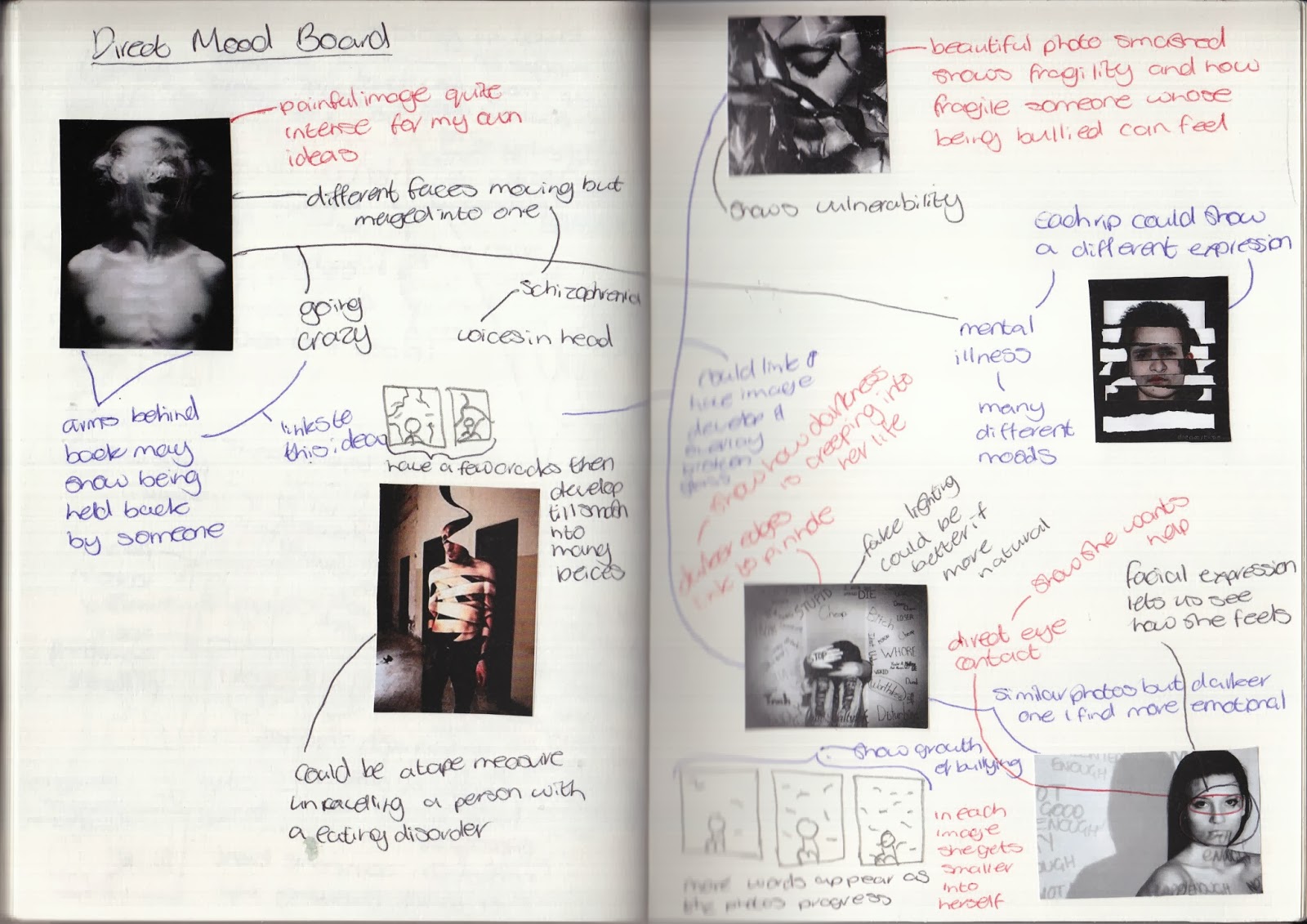
Direct Mood board

Looking at my mood board and brainstorm I found a few ideas and photographs stood out to me. I have pulled these ideas out and created a more direct mood board trying to focus more on creating an idea.


From this research I found mental illness and bullying to be slightly more interesting than eating disorders.

Research

Looking at my ideas I have decided on two topics; bullying and mental illness. Both these ideas can interlink but for now I want to keep them separate. I am planning on looking at other artists who work around these ideas and how they present their ideas.

Benoit Paille

Benoit Paille is a French-Canadian photographer. I didn't find a lot of information about her but what I did find was that she captured photographs of children's eyes. Reflect in their eyes was a wall in which their own drawings about school bullying were presented. 
Within this photographers work I found her photographs are very similar and to try and understand her more I have analysed a key piece of her work:

Neil Harrison

Neil Harrison is a commercial photographer who photographed a anti-bullying campaign in 2012. He wanted to create generic photographs which could be related to any young person being bullied anywhere. He photographed the campaign in a modern school in capture this. He also wanted to include images about modern cyber bullying and he did this through placing a girl in a classroom. I found this section of his website to be very useful in investigating him and his campaign: http://neilharrisonphotography.com/wp/anti-bullying-week/.
I found his work to be very influential its not as dull and dark as some bullying photographers and the emotion is conveyed within the models themselves. I have analysed a photograph of his which I found to be very influential:


Venn Diagram

Looking at both these artists I found they produce work with the same concept but in very different ways. Below I have compared these two artists and a key piece of each of their works. 


Charlie MacPherson

Charlie MacPherson creates semi-autobiographical photography. She uses her own experiences to present different emotions within her artwork. One thing she focuses on is the way in which society distorts and conceals things - only showing us what is expected. This idea links to mental illness as society only displays to us images that it wants us to see. We never truly see the truth of these things. Investigating this idea I found the idea of being trapped linked well to mental illness and this artist traps models behind sheets of film and photographs them.
Her work is very similar and one piece which stood out was the one below which I have analysed:


Hana al Sayed and Jacob Sutton

Hana al Sayed and Jacob Sutton work together collaboratively to produce beautiful underwater photographs mirroring the idea of entrapment. Hana al Sayed produces the set design for many of these photographs and Jacob Sutton captures these photographs. 
I found one piece of their work to be very interesting. It highlighted the use of water and being trapped:


Venn Diagram

Now I have looked at both these artists which focus on entrapment and feeling trapped within mental illness I wanted to compare them and contrast them. Below is a venn diagram of this:


Artist Response

Now I have looked closely at these four photographers work I want to try and collaborate their ideas to produce a response based on their work. 

Within the concept of bullying I want to focus more on the work of Benoit Paille. Her work is incredibly simple and yet evokes such strong emotions. I want to focus on capturing a emotional photograph like that of hers. Some key parts to her photographs are:
  • The lack of intense lighting - the natural light means its not overpowered.
  • Close up photographs of the eyes - the eyes tell the story I need to ensure the model can encapsulate this.
  • Using airbrushing to enhance the sharpness of the eyes rather than to hide the imperfections of the model.
  • The reflection in the eyes need to mirror a idea of bullying. - I could develop it by putting words overlaid on the eyes and possibly add images of people bullying this person and overlay them in the eyes as well.

Contact Sheets


Chosen Photograph


I wanted this image to be in the style of  Benoit Paille therefore it needed to be upclose, symmetrical and have developing light with clear emotion. 
I chose this image as out of all my other ones it conveyed the most emotion in my models eyes. As I look at it I feel she could be truly upset and be bullied.
I did however, find that using a studio amber light gave a softer feel to the image and I should experiment with a white light to get a paler light making the skin look pale and the model look vulnerable.
I took the photograph into Adobe Photoshop and began the editing process. To clean the image up I adjusted the levels making it more even and enhanced. Also I found the image was titled so this needed to be corrected. Using rulers I pinpointed the center of the image and made sure the nose fell in the center and the eyes were in line with one another. I then had to crop it so it fit in the shot also this way it was more upclose. Also a key part of Paille's photography is the use of airbrushing to make the eyes of her model sharper so using Gaussian blur I created this effect. I also found that Paille's photography used light direct in the middle making the edges darker, therefore using gradient effect I enhanced this. 

Experiment 1


This experiment I overlaid an image of bars onto the eyes in an attempt to mirror how Benoit Paille uses lighting to reflect the wall of abuse which her models are looking towards. I however, faked this by using Photoshop techniques to overlay a image of bars.
I feel it doesn't look realistic but it does convey a sense of entrapment which reflects the idea of someone who is bullied being trapped in their own way. It also shows the idea of mental illness and someone being trapped in their own thoughts. 
This idea of entrapment links to the idea of placing something over someones face to make it distorted and give distance from the camera. 

Experiment 2


I wanted to test if reducing the photograph of all colour would affect the emotion portrayed within the image. I found that it did make it more emotional but removed the idea of childhood and vulnerability which colour allows. It needs more depth within the image. The desaturation also changes the mood making it more eerie than sad which it should be. However, I could work with merging the colour and the black and white together. 

Experiment 3

Previously I have worked with ripping images up to show fragility and mirror how broken someone can feel. I have experimented in a few different ways with this idea.

1) I printed out a small copy of the image and using a ruler ripped it up and then stuck it back together again.
I found that in doing this some pieces didn't fit back together perfectly. I liked this as it enabled the image to show how someone being bullied can't simply pick themselves up and act like nothing went wrong.


2) I worked with the black and white and the colour image to merge them together.
I wanted to see if the combination would affect the mood I was trying to portray.
I found that it didn't work very well. I wasn't very happy with this as it didn't really show much. However, I could develop this by taking a photograph of someone smiling and being happy and take a photograph of someone looking sad and merge the two together.
I have done a quick experiment to see if this would work (merging emotions into one photograph).


I tried to merge the photographs in different ways. Straight down, horizontal and diagonal. I found it didn't have quite the same affect as if I had done it by physically ripping it. However I did learn that there are a few ways of merging photographs. Also although it isn't clear I would like to play around with emotions and merging a few emotions into a single photograph.

3) I felt the key part of the image was the eyes so I wanted to work with physical colour splash and ripped around the eyes keeping them in colour but the rest in black and white.
I found that this almost ruined the picture, it makes it less clear on the meaning of the image. I could, however work with doing colour splash digitally.
Below is a quick experiment with digital colour splash:

I found having the eyes in colour made them look rather evil. This completely subverted the emotion I wanted to portray. I feel after doing this experiment colour splash wouldn't be great for this theme.


Experiment 4


This experiment was to see the effect of physically writing over a photograph to show the physical affect of bullying. 
I could develop this idea by doing a series of photographs moving from one just a single shot, then having some writing on the photograph, then more, then the whole thing being ripped up. Below I drafted this idea on a post-it.


Experiment 5


For this experiment I wanted to work with type and words. I was investigating if overlaying type onto the eyes would convey the sense of sadness the girl feels.
However, the use of red makes her eyes look filled with anger which juxtaposes the idea behind the image. I feel I should of used a softer colour like blue to mirror the tears in her eyes showing sadness. I warped the words to the eye which made them fit better but due to the colours of the eye and words its difficult to easily tell what words are written.

Experiment 6

For this experiment I took a photograph of water droplets on a glass window. I wanted to overlay the water to show how this could mirror the tears she is trying to hide. For this I did a few different experiments working with overlay, opacity and rubbers.

1) Opacity - for this image I simply lowered the opacity to 56%.
I wanted to just see if it was visible enough and still looked good. I found there were almost too many water droplets and that certain parts of the face were as easily seen,


2) Overlay - for this image I used a hard light overlay and rubbed out the fringe of the model and some water droplets at the side.
I wanted to see if it looked more real with the overlay. I found it did work better with the overlay but it made the image look much darker than it already was.


3) Rubbers - for this image I changed the overlay to soft light, the opacity to 60% and using a large rubber at 50% opacity rubbed out the image.
I found rather than making the water droplets look less intense it nearly removed them altogether. I think I need to brighten the water droplets when I originally capture them before so they are bright when they are overlaid.


Experiment 7

Earlier I tried to experiment with overlaying a amalgamation of words onto the eye. To develop this I have photographed a fist and overlaid it onto the eye of the image.


I wanted to try and show how bullies are always watching and threatening others. I like the principle of this idea however in practice this could be worked on more. Having two identical fists isn't realistic and it could be made more emotional if it displayed other ways of bullying possibly having someone whispering. I could merge my earlier idea of overlaying words onto the eyes with a physical fist to show the different ways of bullying.

Within the concept of mental illness I have decided to focus more on entrapment. As a result of this, I have decided to focus on the work of Charlie MacPherson but incorporate ideas from Hana al Sayed and Jacob Sutton's work. Some key thing I will have to think about within their work are:
  • Placing someone behind a blurry screen to show distance
  • Possibly making the face in full focus but the rest not
  • Using dark and possibly subdued lighting to create a emotionally dark response
Contact Sheets


Chosen Image


I chose this image as I felt it was the best out of all my ideas. The colours are intense and you can clearly see the shape behind. However, I don't feel it links very well to my artist and I need to play around with it more, trying out effects and other ideas.

Experiment 1


I reduced to brightness and contrast for this image making it slightly more dull to try and reflect my artist inspiration. I don't want this photograph to look 'creepy' as much but more emotional like someone is reaching for help. I don't feel this is conveyed here. 

Experiment 2


For this image I reduced the vibrancy and saturation to try and see if removing a lot of colour from the photograph created more emotion. My intention was to showcase the pain and sadness within the person behind the sheet however this didn't work.

Experiment 3


I wanted to try out blurring the image to show distance from camera. My artists use blur in a creative way and I wanted to try and replicate this. I kept the colours the same as experiment 2 but worked with Gaussian blur and overlay and opacity to make it not too overpowering. I found it didn't look very different as opposed to it looking intentionally blurred it looks as if the camera wasn't focused.

Experiment 4


Previously I have worked physically with experiments and wanted to try and show how people with mental illness can feel trapped and want to give up. To mirror this I printed off the image and then screwed it up into a ball before scanning it in. 
I like the effect of screwing it up however, the base photograph wasn't great and therefore you can't tell what the photo is. However, I do feel this effect is something I can work with more.