Soon I will be embarking on my exam time and before hand I want to ensure I have a good idea of what I want to do. Previously I have looked at artwork involving mental illness, eating disorders and bullying. Within these ideas I have explored experimental photography and emotional photography. I know need to start creating a more direct idea.
Brainvomit

Visual Mood Board

Direct Mood board
Looking at my mood board and brainstorm I found a few ideas and photographs stood out to me. I have pulled these ideas out and created a more direct mood board trying to focus more on creating an idea.
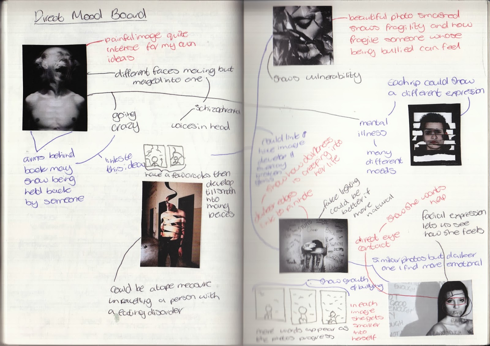
From this research I found mental illness and bullying to be slightly more interesting than eating disorders.
Research
Looking at my ideas I have decided on two topics; bullying and mental illness. Both these ideas can interlink but for now I want to keep them separate. I am planning on looking at other artists who work around these ideas and how they present their ideas.
Benoit Paille
Benoit Paille is a French-Canadian photographer. I didn't find a lot of information about her but what I did find was that she captured photographs of children's eyes. Reflect in their eyes was a wall in which their own drawings about school bullying were presented.
Within this photographers work I found her photographs are very similar and to try and understand her more I have analysed a key piece of her work:

Neil Harrison
Neil Harrison is a commercial photographer who photographed a anti-bullying campaign in 2012. He wanted to create generic photographs which could be related to any young person being bullied anywhere. He photographed the campaign in a modern school in capture this. He also wanted to include images about modern cyber bullying and he did this through placing a girl in a classroom. I found this section of his website to be very useful in investigating him and his campaign: http://neilharrisonphotography.com/wp/anti-bullying-week/.
I found his work to be very influential its not as dull and dark as some bullying photographers and the emotion is conveyed within the models themselves. I have analysed a photograph of his which I found to be very influential:

Venn Diagram
Looking at both these artists I found they produce work with the same concept but in very different ways. Below I have compared these two artists and a key piece of each of their works.

Charlie MacPherson
Charlie MacPherson creates semi-autobiographical photography. She uses her own experiences to present different emotions within her artwork. One thing she focuses on is the way in which society distorts and conceals things - only showing us what is expected. This idea links to mental illness as society only displays to us images that it wants us to see. We never truly see the truth of these things. Investigating this idea I found the idea of being trapped linked well to mental illness and this artist traps models behind sheets of film and photographs them.
Her work is very similar and one piece which stood out was the one below which I have analysed:

Hana al Sayed and Jacob Sutton
Hana al Sayed and Jacob Sutton work together collaboratively to produce beautiful underwater photographs mirroring the idea of entrapment. Hana al Sayed produces the set design for many of these photographs and Jacob Sutton captures these photographs.
I found one piece of their work to be very interesting. It highlighted the use of water and being trapped:

Venn Diagram
Now I have looked at both these artists which focus on entrapment and feeling trapped within mental illness I wanted to compare them and contrast them. Below is a venn diagram of this:

Artist Response
Now I have looked closely at these four photographers work I want to try and collaborate their ideas to produce a response based on their work.
Within the concept of bullying I want to focus more on the work of Benoit Paille. Her work is incredibly simple and yet evokes such strong emotions. I want to focus on capturing a emotional photograph like that of hers. Some key parts to her photographs are:
- The lack of intense lighting - the natural light means its not overpowered.
- Close up photographs of the eyes - the eyes tell the story I need to ensure the model can encapsulate this.
- Using airbrushing to enhance the sharpness of the eyes rather than to hide the imperfections of the model.
- The reflection in the eyes need to mirror a idea of bullying. - I could develop it by putting words overlaid on the eyes and possibly add images of people bullying this person and overlay them in the eyes as well.


Chosen Photograph

I wanted this image to be in the style of Benoit Paille therefore it needed to be upclose, symmetrical and have developing light with clear emotion.
I chose this image as out of all my other ones it conveyed the most emotion in my models eyes. As I look at it I feel she could be truly upset and be bullied.
I did however, find that using a studio amber light gave a softer feel to the image and I should experiment with a white light to get a paler light making the skin look pale and the model look vulnerable.
I took the photograph into Adobe Photoshop and began the editing process. To clean the image up I adjusted the levels making it more even and enhanced. Also I found the image was titled so this needed to be corrected. Using rulers I pinpointed the center of the image and made sure the nose fell in the center and the eyes were in line with one another. I then had to crop it so it fit in the shot also this way it was more upclose. Also a key part of Paille's photography is the use of airbrushing to make the eyes of her model sharper so using Gaussian blur I created this effect. I also found that Paille's photography used light direct in the middle making the edges darker, therefore using gradient effect I enhanced this.
Experiment 1

This experiment I overlaid an image of bars onto the eyes in an attempt to mirror how Benoit Paille uses lighting to reflect the wall of abuse which her models are looking towards. I however, faked this by using Photoshop techniques to overlay a image of bars.
I feel it doesn't look realistic but it does convey a sense of entrapment which reflects the idea of someone who is bullied being trapped in their own way. It also shows the idea of mental illness and someone being trapped in their own thoughts.
This idea of entrapment links to the idea of placing something over someones face to make it distorted and give distance from the camera.
Experiment 2

I wanted to test if reducing the photograph of all colour would affect the emotion portrayed within the image. I found that it did make it more emotional but removed the idea of childhood and vulnerability which colour allows. It needs more depth within the image. The desaturation also changes the mood making it more eerie than sad which it should be. However, I could work with merging the colour and the black and white together.
Previously I have worked with ripping images up to show fragility and mirror how broken someone can feel. I have experimented in a few different ways with this idea.

I found that in doing this some pieces didn't fit back together perfectly. I liked this as it enabled the image to show how someone being bullied can't simply pick themselves up and act like nothing went wrong.

I wanted to see if the combination would affect the mood I was trying to portray.
I found that it didn't work very well. I wasn't very happy with this as it didn't really show much. However, I could develop this by taking a photograph of someone smiling and being happy and take a photograph of someone looking sad and merge the two together.
I have done a quick experiment to see if this would work (merging emotions into one photograph).


I tried to merge the photographs in different ways. Straight down, horizontal and diagonal. I found it didn't have quite the same affect as if I had done it by physically ripping it. However I did learn that there are a few ways of merging photographs. Also although it isn't clear I would like to play around with emotions and merging a few emotions into a single photograph.

I found that this almost ruined the picture, it makes it less clear on the meaning of the image. I could, however work with doing colour splash digitally.
Below is a quick experiment with digital colour splash:
 I found having the eyes in colour made them look rather evil. This completely subverted the emotion I wanted to portray. I feel after doing this experiment colour splash wouldn't be great for this theme.
Experiment 4

This experiment was to see the effect of physically writing over a photograph to show the physical affect of bullying.
 I could develop this idea by doing a series of photographs moving from one just a single shot, then having some writing on the photograph, then more, then the whole thing being ripped up. Below I drafted this idea on a post-it.
Experiment 5

For this experiment I wanted to work with type and words. I was investigating if overlaying type onto the eyes would convey the sense of sadness the girl feels.
However, the use of red makes her eyes look filled with anger which juxtaposes the idea behind the image. I feel I should of used a softer colour like blue to mirror the tears in her eyes showing sadness. I warped the words to the eye which made them fit better but due to the colours of the eye and words its difficult to easily tell what words are written.
Experiment 6

For this experiment I took a photograph of water droplets on a glass window. I wanted to overlay the water to show how this could mirror the tears she is trying to hide. For this I did a few different experiments working with overlay, opacity and rubbers.

I wanted to just see if it was visible enough and still looked good. I found there were almost too many water droplets and that certain parts of the face were as easily seen,

I wanted to see if it looked more real with the overlay. I found it did work better with the overlay but it made the image look much darker than it already was.

3) Rubbers - for this image I changed the overlay to soft light, the opacity to 60% and using a large rubber at 50% opacity rubbed out the image.
I found rather than making the water droplets look less intense it nearly removed them altogether. I think I need to brighten the water droplets when I originally capture them before so they are bright when they are overlaid.
Experiment 7
Earlier I tried to experiment with overlaying a amalgamation of words onto the eye. To develop this I have photographed a fist and overlaid it onto the eye of the image.

I wanted to try and show how bullies are always watching and threatening others. I like the principle of this idea however in practice this could be worked on more. Having two identical fists isn't realistic and it could be made more emotional if it displayed other ways of bullying possibly having someone whispering. I could merge my earlier idea of overlaying words onto the eyes with a physical fist to show the different ways of bullying.
Within the concept of mental illness I have decided to focus more on entrapment. As a result of this, I have decided to focus on the work of Charlie MacPherson but incorporate ideas from Hana al Sayed and Jacob Sutton's work. Some key thing I will have to think about within their work are:
- Placing someone behind a blurry screen to show distance
- Possibly making the face in full focus but the rest not
- Using dark and possibly subdued lighting to create a emotionally dark response
Contact Sheets


I chose this image as I felt it was the best out of all my ideas. The colours are intense and you can clearly see the shape behind. However, I don't feel it links very well to my artist and I need to play around with it more, trying out effects and other ideas.
Experiment 1

I reduced to brightness and contrast for this image making it slightly more dull to try and reflect my artist inspiration. I don't want this photograph to look 'creepy' as much but more emotional like someone is reaching for help. I don't feel this is conveyed here.
Experiment 2

For this image I reduced the vibrancy and saturation to try and see if removing a lot of colour from the photograph created more emotion. My intention was to showcase the pain and sadness within the person behind the sheet however this didn't work.
Experiment 3

I wanted to try out blurring the image to show distance from camera. My artists use blur in a creative way and I wanted to try and replicate this. I kept the colours the same as experiment 2 but worked with Gaussian blur and overlay and opacity to make it not too overpowering. I found it didn't look very different as opposed to it looking intentionally blurred it looks as if the camera wasn't focused.
Experiment 4

Previously I have worked physically with experiments and wanted to try and show how people with mental illness can feel trapped and want to give up. To mirror this I printed off the image and then screwed it up into a ball before scanning it in.
I like the effect of screwing it up however, the base photograph wasn't great and therefore you can't tell what the photo is. However, I do feel this effect is something I can work with more.
No comments:
Post a Comment