Monday, 12 May 2014

Evaluation

What is your work about?

My animation is about anti-bullying. I decided to focus on the growth of bullying and how it can develop and change the victims life. I wanted to show how bullying can affect people and change their perspectives of life. I wanted to create an emotional animation which makes people stop and think about the effects of bullying and how in extreme cases it can be fatal. Many people around me and myself have been bullied so I feel very passionate about this subject and wanted to show it by combining their stories into one making it more realistic. The animation displays a persons account of bullying and the drawings demonstrate their feelings and what was happening at the time. I used minimal colours to make it more raw and emotional and allow the words to speak for themselves. Coupled with the child-like drawings to communicate how bullying can affect many people. Also I use many images of the female speaker however she always looks different to show how bullying can affect many different people and although this is one person telling their story they are speaking the emotion thousands of young people feel everyday.

How did you make it and what media did you use?

I made the animation by hand-drawing/tracing images I found online which linked to the idea in each scene. I then scanned these into the computer and drew over them in Photoshop to create my animation. I added a vocal track which I recorded in an open room so there was a little bit of echo and some background noise but not too much to stray attention. I made each individual scene in Photoshop and then complied them all together in Premier to create the final animation. 

How did you develop your main idea? How did it change as your progressed? Which artists influenced you?

My initial idea developed from the theme of Growth and Evolution was emotional photography based around the ideas of; bullying, mental health and eating disorders. From this I began to look at influential artists, I found the work of Phillip Toledano and Sophie Calle very interesting and the use of subdued lighting makes the piece stand out more and more emotional. I then began developing a line of enquiry and looked at the 3 ideas of bullying, mental illness and eating disorders. From mood boards and brainstorms I decided to start focusing more on the idea of mental illness and bullying as I found both these ideas could interlink. Benoit Pallie I found t be very inspirational, her up close photography of children who had experienced bullying was very emotional through the simplicity of it. I began playing around with the same ideas as her work and started to re-create my own version of her work. Thats when I decided I wanted to follow the line of bullying solely. I began looking at anti-bullying campaigns, photography and animation. To This Day an inspirational animation based around a speech by someone who was bullied was very influential. I went on to create my own version of this animation by using a male speaker and illustrating his words. From this animation I found it was very emotional and could communicate my ideas about anti-bullying well. Therefore, I went forward with this idea, looking at real-life accounts of bullying as well as fictional stories online and eventually developed my own narrative combining all the stories I had found through research. I then created a mock-up in which I experimented with different drawings and colour. From this I found the drawing needed to be consistent and that the role of colours needed to be explored. In the end I created a 1.47 minute animation with a consistent drawing style and that only used the colours black and white. 

What worked and what didn't work?

The most successful part of my work was the structure of the narrative. It clearly tells the story of the emotion the female speaker has gone through during this traumatic time. I feel the drawings turned out well, they were consistent throughout which meant that they added a sense of continuity within my work. The minimalist approach worked well for this theme as the use of colours, I feel, could of overpowered the drawings and the speech. The timings worked better than my mock-up as it meant that the drawings stayed on screen long enough for the audience to take in what was being shown. 
The area I am least happy with is the quality of some of the drawings. Some drawings could of been improved making them of higher quality so they look better. I feel this could of been done if I had more time and had possibly used less images so that the ones I did use were high in quality. 

If you had the opportunity to do it again what would you change?

If I had a chance I would change my initial drawings. I did drawing and then scanned them in to draw over digitally to create my animation. However, I feel it may of been better had I photographed each event then digitally drawn over it. That way I would of had a combination of an animation and photographs to help illustrate the story. However, due to a lack of timings I couldn't do this originally. Also I would have planned more for what to do during the exam so I made sure I had enough time to complete every task to a high standard. That way I wouldn't of rushed making my iPad cover and could of possibly developed that roe to be high quality. 

Saturday, 10 May 2014

Final Exam Response

Below is my final animation response to the exam title 'Growth and Evolution'.

A animation should show up below, if it faisl to do so pelase click this link https://vimeo.com/94744726 or alternatively I have a copy of the animation of a disc in 'Busy Book 2'.


Anti-Bullying Animation from Amy Taylor on Vimeo.

Friday, 9 May 2014

Alterations to animation

When I began my exam there were a few things I thought of during the exam which I needed to work on.

Introduction

I realized my animation had no definitive opening and therefore I needed to create one. When creating my introduction I wanted it to link somehow to the rest of my work. Therefore I placed the 'Report Abuse' logo on the front and then also placed it on the leaflet to pull it all together. I wrote the words "speak out about BULLYING" as my animation is someone telling their account of their bullying experiences.


Introduction to animation:
If it fails to play go on this link: http://vimeo.com/94748459


Anti-Bullying Animation from Amy Taylor on Vimeo.


When creating my introduction I found the lines went very thick every time I duplicated the layer, therefore, I kept the background layer of each layer blank and then placed each element on a new layer to keep the previous image lit but not duplicated. I also merged the introduction with the first image of my animation so that it flowed into the next scene. My plan is to start the vocals once the house is fully on the screen.

Scene 6 changes

When I began making scene 6 I found a few problems. The images weren't on screen as long as they should of been and therefore they didn't match the vocals. Also when the loo roll zoomed it it made it look poor quality. Therefore I changed it and instead of having it zoom in I added a lock and when the lock came on it matched the timing of when she says "I locked myself" that way it fits with the theme. I had to draw this freehand however as I didn't have enough time to draw it up on paper then scan it in. I will now put the words on the lock. Below is how scene 6 now looks:

If the file fails to play click this link: http://vimeo.com/94748459


scene 6 from Amy Taylor on Vimeo.

Monday, 5 May 2014

Re-recording vocals

Looking back at my animation, I found there wasn't large pauses between each sentence and this means each image has to be rushed to keep up with the vocals. Therefore, I have re-recorded the vocals to allow more of a space between each section to allow the drawings to stay on the page slightly longer. This means the viewer can absorb the drawings and fully appreciate the animation.
Below is my new vocals:

As I have new vocals, I need to re-do my timeline. I need to ensure the timings allow a break between sections so I can do each section as if each bit was a new scene. Below is my new timeline:


Saturday, 3 May 2014

6 - Presenting the Animation (need to finish)

Now I have planned how I will improve my animation I need to work out how I will present it. I plan on presenting it on an iPad so it's easily view able for others e.g. examiners rather than having it on a laptop or projected onto a screen.
However, to add something to the presentation I plan on creating an iPad cover on which the viewer will open it and on the iPad will be my animation ready to play.
To keep the iPad case in-keeping with the theme of my work I will make the cover look like a leaflet about bullying and how to get help. I plan on printing and sticking the leaflet style cover onto card then using velcro I will stick the card to the iPad. 
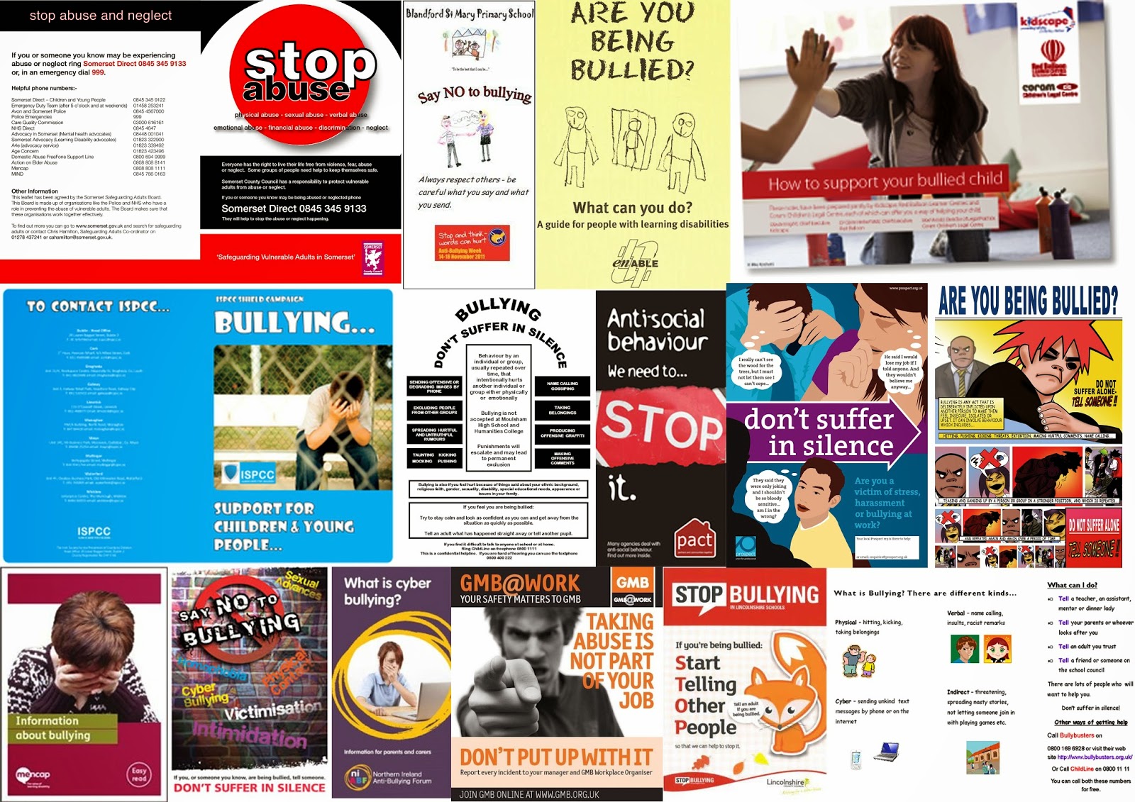
Firstly I need to research leaflets about abuse. 


The main thing I found with all of these leaflets was the fact that they are all rather cheesy. They are good but slightly exaggerated and aren't very emotional. I want to keep this idea within my own work so when they open the leaflet they will see my more emotional animation. Another thing I liked was the hand-drawn element. I feel I could also adopt this idea as my animation is based around the idea of hand drawing all the sections and I feel I could make my leaflet a similar style to the animation to link it all together. If the leaflet contained photographic elements of colourful elements it wouldn't link very well.
Based on the mood board above I have created 6 thumbnail ideas of what my leaflet cover could look like.
  1. This idea is very basic, I plan on colouring it in black, white and red with the red being the stop sign. However, it is very basic in that it looks more like a poster than a leaflet cover and I wanted it to look like a leaflet. 
  2. I like this cover as it does look like a leaflet, however, it is very similar to another leaflet which I saw in my mood board so I will need to alter it slightly to look more like my own work.
  3. This looks very basic and childish and from my research I found that some leaflets are actually colourful and bright and look interesting as opposed to this idea.
  4. I like the simplicity of this idea. The hands show clearly the message however it does look again like a poster but if I altered it slightly I feel I could make it look more like a leaflet.
  5. This one I feel looks like a leaflet as it is clear what message it shows and you could imagine opening it to find information on how to speak out about bullying.
  6. I like this one as it has a rhetorical question so you would expect to open the leaflet to discover the answer. However, again it is very basic and simple and I feel it doesn't stand out as much as I would like.
From the ideas above I felt my best 3 were number 2, 4 and 5 as they looked best and stood out most to me. However, these are very basic ideas and I need to make them look more refined. 

I took the 3 ideas above and made them more refined:

A. I liked how simple this idea was and I feel it does link                              well to my animation as as the animation is a person speaking out about being bullied. However, I feel it looks more like a anti-bullying poster and I want my work to look like a leaflet so when you open it you have information inside.

B. I like this one a lot, it looks most like an information leaflet and the arrow conveys that the audience should open it to see whats inside. However, it needs a lot of work with colours as I don't feel having the writing in red is the right colour.

C. I feel this image is strong however, the arms look bad and need some work. I feel it clearly shows a message and much like A it is very minimal. However, also like A it looks more like a poster compared to B and I feel if I take it further I need to convert it too look more like a poster.


As my animation is hand drawn I feel the leaflet cover needs to be the same. Therefore, I am going to convert B and C into digital images to see which I prefer.


I did both of these ideas in Photoshop as that is what I will use for my animation. However, as this is going to be printed the quality of the drawing needs to be higher so when I create the cover I will do it in Illustrator as that uses vector lines so it will be better quality. I like both of these ideas however they I feel are very different. Number 1 seems to have a lot of negative space and doesn't make as much sense as number 2. Number 2 is straight to the point and explains instantly the theme of my animation. I also feel I could easily incorporate this into my animation, possibly having it at the end of the animation. Yet, I do feel that number 1 looks more like a leaflet as it has a question which could be explored within the leaflet. A main factor of these is the font used, the writing isn't great and as there is writing within my animation I feel I should try to use the same font for all writing in my animation and cover. I like the arrow from number 1 and I like the hands from number 2, so I feel it would be good to combine these ideas for my final leaflet idea. Therefore I took the images into Illustraor and began creating my final leaflet design .


I like this design and feel it is good, however, the drawing of the hands is very detailed unlike the animation itself, also I feel the design should link more to my actual animation so have certain elements from my animation within it to tie it all in together. Also my animation will be viewed landscape and I have been designing leaflets which will be portrait so I need to re-design the leaflet to be landscape. 

New idea:
I like this idea because its simple and I feel sends the message behind my work. Also the image I have used is used within my animation to show someone shouting abuse at a bully victim so subverting it's use here juxtaposes its meaning. This highlights how bully victims can be strong and speak out and links to the idea behind my animation as its a person speaking out about their bullying experiences.
Adding colour:

I like how the colour brings the piece to life a lot. My only worry is that at the moment by animation has no colour and I want to ensure the animation and leaflet are in sync with each other. As a result, I have decided to change the design. I feel this still looks more like a poster and want to change it more to look like a leaflet. Therefore, I am going back to my original idea but changing it slightly so it links in more with my animation.


Another new leaflet design:

I may a few changes to this design as I wanted to make the lines bolder. I then printed it off and turned it into a iPad cover. Below is a step-by-step of how I did it:


Friday, 2 May 2014

5 - Improvements to my Animation

When I looked through my animation I found three specific parts which needed to be altered. Below I have altered them:

Smiles in section 2 need to appear one by one -
I have changed this section from being one big face with others around it to being a person with only a few people around them. Each person will appear one by one and will be in more detail and look obviously different to the girl. Also I didn't feel the colours in this section originally worked well so I have removed the colours.

Where mouth is on screen with words make mouth more obvious its shouting - 
I have changed this by making the mouth appear more open so it is more obvious they are shouting, the mouth is also on a slight angle showing how they are shouting towards someone. I don't like the colour of the writing however in this section so need to possible look at colour representation and pick a better colour.


Report abuse logo - ensure the logo is the right colours and style - 
For this section I wanted the report abuse logo to stand out more so it was more obvious. I also wanted to ensure it was the right colours for the logo. Therefore I found the logo and copied it exactly to ensure that it was obvious. I plan to make the mouse move up the screen and when it touches the logo, the logo will light up red (the colour of the logo) to make it stand out. This is one of the only things that will be in colour to make it stand out more compared to the rest of the animation. 


Thursday, 1 May 2014

4 - Understanding Narratives

In order for my animation to be consistent I need to ensure the frames are all the same length. To do this accurately I am going to draw up a timeline with each drawings to work out how long each section will be. Below is this timeline, I will use this when creating my animation to ensure each section has a start and end.


Also to ensure I don't loose my work at any time I will split each section into its own scene and based on the timings will draw each section to it's certain length then go into After Effects to render it to retain it's quality as opposed to fully doing everything in Photoshop.

Wednesday, 30 April 2014

3 - Role of colours

As part of my animation I have used a bit of colour. However, I wanted to explore more how colour can reflect moods. Previously in my busy book I did a page of painting in which colours developed into one another. I have replicated this in Photoshop using a small GIF style animation.

Experiment 1

Experiment 2


From these experiments I found colours did flow easily into one another however, the main thing I need to look at now is the role colours play and what each colour can represent. Below I have created a colour chart which explores the meaning of colours and what they represent. I found out this information from various web searches. 


Tuesday, 29 April 2014

2 - Tightening up technical elements

As I have done my research I found that the animations were successful as they were consistent. They came up with an idea and carried it on. The animations were either simple or complex but it never strayed for its ideas. Therefore I need to explore this within my own work.

1) Keep drawings consistent - 
In my animation I go often from having straight lines to have free hand drawings. For my animation to be successful the drawings need to be consistent. Therefore, I am going to plan my animation and hand draw myself the images, scan them in, then in the animation I will digitally draw over them.


2) Transitions between each section - 
In order for my animation to run smoothly I need to transitions to run seamlessly from one to the other. To do this I will split each sentence into sections and within each section make every drawing flow into one another then at the end of each section have a white screen to indicate that a new scene is starting to allow viewers to digest what they have just seen. 

3) Type face - 

Another thing I need to experiment with is type face as I often use words in by work and I want to find a type face which works well with my idea. Below is some hand drawn and digital fonts which I liked to use for my final animation. 


I have chosen to use the font which is left on my digital testing. I choose this as I found it worked well with my idea, it was a teenager font I felt and was very basic. The bubble writing was slightly over the top and exaggerated so by using this basic font it won't draw attention. In my animation I will digital draw over the top of the words so that it is all similar styled to tie it all in together. 

Thursday, 24 April 2014

1 - Research

I have already looked into other anti-bullying animations and how they are creative. However, now I want to widen my research to look at other animations to see how other artists use narrative and drawing styles to convey meanings behind their work.

Simons Cat

Simon's cat is a animated cartoon which has developed over years into a huge thing. It is now books and mini films. Created by British animator Simon Tofield the animations feature a hungry house cat who uses increasingly heavy-handed tactics to get its owner to feed it. 


The animation uses light humour to entertain the audience. It uses simple animations to convey he narrative and all the drawings are consistent. The key theme throughout is the cat and this is highlighted by the fact that nothing else moves a lot compared to the cat. I feel it is good as it has simple drawings used consistently and in the same way. However, there doesn't appear to be much of a storyline or a narrative, yet this is because it is a series of animations so the narrative is continuous throughout all animations. 

ASDF movies

ASDF movies were made TomSka a YouTuber. They are short clips which have mini stories for each clip. They have become hugely popular as they are so simple which makes them so much funnier.


There is an element of simplicity within this animation as all the people are basic and look the same. The artist has just the same style for each person. However, there are parts where the drawing changes, this ruins the continuity of it as it makes it seem better in parts. I feel if it had been kept the same style it would have appeared better. The transitions are smooth and indicate clearly that a new section is starting. There is a good storyline for each section eve if it is only a few seconds long which helps keep the viewer interested. Also it uses minimal colour consistently which helps keep it all similar.

Warwickshire waste partnership war on waste public information

This is an animation designed to try to encourage residents of Warwickshire to reuse and recycle as much as possible. It is done in the style of a 1940s public information video highlighted with the voice over the top. It was designed to try and inform residents on recycling.


This animation uses a lot of colour and uses it well. Colour is used to make certain things stand out more than others. It is done in a 1940s style which is juxtaposed by the fact that it is a animation - a modern concept. It is quite complex in its style as it uses shading and depth of field to make certain things stand out. There is a clear meaning behind it which is conveyed through the speaker over the top, interacting with the characters and making it obvious what is going on. The animation itself simply describes what the person is saying helping the audience stay interested and understand the meaning.

Its smarter to travel in groups. Take the bus

This is an animation for a company called De Lijn, they are a travel company based on Belgium, Flanders and find ways for people to travel around Flanders by bus or tram. This is an advertisement advertising their company.


The animation has simple subtle humour and although it appears complex through its style, the fact it is just animals makes it slightly simple. Its rather amusing because its animals and is slightly bizarre. The animation style is consistent and the theme is carried out throughout the whole animation, the idea is simple travel in groups. It explains the idea in a complex way, which is good for this animation as there is no wording, however, for my own animation I feel it is slightly too complex.

Wednesday, 23 April 2014

Preparation for my Exam

Now I have done my mock-up and some further experimentation I want to look into what improvements I need to make within my animation.
  1. Research
    • Look into other animations for how they use drawings and speech
    • Simons Cat animation - how they use drawings and narrative
  2. Tightening up technical elements
    • Keep drawings consistent - use all straight lines or all free hand don't mix the two
    • Transitions between each section - pause between sections to allow audience to take on board what has been said/shown
    • Type face used needs to be consistent keep the writing the same - possibly get someone to write all words and copy them
  3. Role of colours
    • Understand colour association
    • Research the role of colours and ensure understand what each colour can represent
  4. Understand of narratives
    • Understand how narratives work
    • Experiment with timelines - keep images the same length and the same time so whole animation is consistent
  5. Improvements of the animation
    • Smiles in section 2 need to appear on page one by one
    • Where mouth is on screen with words make mouth more obvious its shouting - experiment with facial expressions
    • Report abuse logo - ensure the logo is the right colours and style
  6. Presenting the animation
    • Show animation on an iPad
    • Make a case for an iPad - use card, paper and velcro
    • Make the iPad look like a leaflet for abuse
    • Research leaflets about abuse - anti-bullying/abuse posters and leaflets - physically do this

Tuesday, 22 April 2014

Experimenting with drawings and speech

I want my animation to be based around someone the age of 15-18 so I recorded 4 people each saying a different and asked them to draw that line so I could get some ideas for drawings within the animation. Below are these. Please click the play button to listen to the recording. 

1 -
It's kinda difficult settling in here. The school is so big. Everyone isn't as nice as I hoped. They all look at me funny as if I'm a wierdo.
Age - 18
Recording -
Image -


2 - 
I'm really struggling to find friends now, I feel so lonely all the time, I'm scared I'll never fit in.

Age - 18
Recording -
Image -


3 - 
In my ICT lesson my teacher showed us the 'report abuse' button. They said it was anonymous. I wonder if I should do it, it might make the girls stop.

Age - 18
Recording -

Image -


4 - 
When I went home I had messages on Facebook. It said I was an idiot. It said if I told anyone they were bullying me they would hurt me.

Age - 18
Recording -
Image -


Tuesday, 15 April 2014

Mock-Up

My plan for my exam is to produce a anti-bullying animation which explores the bullying experience of a young girl. Previously I have written out the narrative I plan to use and now I will record someone speaking that narrative and then draw the animation accordingly. Below is a vocal clip of a young girl speaking the words of my narrative:
Please note, this does work however it is slow to start up so please bare with it and it will eventually load and you should hear the sound. If it fails to upload or you don't see a grey bar on the screen click this URL and find located on the side of the screen the same bar: https://archive.org/details/REC005_201404


Now I have my vocals I needed to draw up the animation. I used Photoshop to produce the animation. Below is the animation. I based the drawings on what I drew in my storyboard.

Below is my animation, if it fails to work please click this link and you will be able to view it online: https://vimeo.com/92021798

Mock Up from Amy Taylor on Vimeo.


Using Photoshop I produced this animation. I started off by inserting the audio files and then drew on different layers the drawing for each section. To begin with I used basic rulers and straight lines to produce
[1]
the animation [1], however, I felt this was too rigid and began using a graphic tablet to physically draw sections of the animation. Once I started to create the animation I felt I wanted to add colour. Previously with my experiments the use of black and white worked well to create a simple animation. However, through my research I found a little bit of colour worked well.
[2]
[3]
Therefore, I used colour for certain sections and felt this helped evoke a strong mood. The use of blue added to the idea of depression and the fact blue and yellow are very opposite colours mirrored the feelings of the victim [2]. I liked the use of colour and wanted to further this by using the colour red as the animation progressed to show the danger of the situation. Finally to finish the animation I developed the use of the colour black [3] as I wanted to show how bad the situation had got towards the end. The dark colour mirrored the darkness of the situation.

Through doing this animation I aimed to create something emotional which made people think about how bad bullying can be. From my previous animation I felt the use of rough sketches was good but didn't show off my technical ability therefore in this new animation I wanted to show off my drawing skills. Within this animation I hoped to draw the viewer in - hence why I made it slightly longer than previously - so that they could explore this persons story and try to understand what they experienced.

I feel the positives about this animation is the fact that it is meaningful. I have based it slightly on truth which helps add emotion to the piece as well as drawing you in. Also the fact that in the beginning the girl is already lonely as she has moved house meant it introduced the viewer to the idea of loneliness a persistent theme throughout. I feel the narrative is the best part of the animation but also the drawings - in places - are a lot better which helps add to it. Also the fact they have been hand drawn adds to the meaningfulness behind the narrative.

There were some problems which did occur however, when producing the animation. The software I chose to use (Photoshop CS6) may not have been the best choice. It was difficult to render the video and ensure it ran smoothly. Also I feel in places the animation jolts slightly and it needs to be far more smoother, this could of been due to the length of each frame being different or the frames developing too quickly. Another point is the use of colour. I feel this could of been developed more, possibly added colour to the background or the parts of the animation e.g. in the beginning could of made the house roof red. In addition to this in parts the drawings weren't very good i.e. the school bus. Finally, I feel the length could of been extended. If the animation was longer it may take the viewer on more of a journey and allow them to be drawn in more. From my research the animation To This Day was approximately 7 minutes long and is very emotional. I could adopt this idea into my own work.

From my mock-up I found a few errors which I want to try and rectify before my final exam. The drawings weren't great as I drew them free hand. However, what I could do is draw the animation by hand and then scan each section into the computer and draw over each section in Photoshop. That way its more meaningful as its based on true drawings.
Colour is something else I could experiment with. Using certain colours to evoke certain moods e.g. black to reflect darkness and blue to reflect depression. Colour could develop to reflect the developing moods of the victim.
I also want to look into using a new software. Photoshop doesn't create as refined animation as I could get from another software. This is something more I could look into when creating my final piece.

Monday, 7 April 2014

Exploring other anti-bullying animations

Now I know I want to produce an anti-bullying animation I want to explore other peoples animations. As animation can be very complex but also very simple. Below I have listed a variety of animations which I found influential and evaluated them in terms of what they do and how they achieve their goal.
In case the hyperlinks don't work I have also placed the weblink underneath.


https://www.youtube.com/watch?v=Q81bsGI-JcY

I found this animation to be incredibly simple. The wording over the top was someone older, which suggests they were reading from a persons diary which could be more emotional. As it could be from the perspective of a parent and that could explore the emotion they feel at their sons death. The animation uses simple drawings which contrasts with the backgrounds as it seems to combine two different types of drawing. The person looks simple and has not great detail which gives it more emotion I feel. The animation itself is short and to the point which gives it more direction and keeps the viewer interested. The ending I found the most powerful. The fact he hung himself in front of the school gives a huge impact on what he experienced. From this I learnt that simplicity is powerful and that the use of dark colours mirror the darkness a person feels when placed in this situation.


https://www.youtube.com/watch?v=p0XKKuIF9zQ

Now, this video is in Spanish I believe so I couldn't understand any of the words. However, the reason I still watched it is because I was drawn to the animation style. I loved how simple it was, the drawings were down on a background which looked like a school book. This showed the significance of school and how it impacts a child's life if they are bullied. I also felt that I could understand what he was experiencing through the drawings. This reinforced to me how important the drawings are in communicating the narrative to the audience.

There are many other anti-bullying short films available online however, I want to focus on animation as opposed to video and these two - as well as To This Day, an animation I studied in my previous post What Next? were very good animated anti-bullying campaigns. They showed me that the animation doesn't have to be perfect and that it can be slightly rough as it will mirror the emotion the victim feels. I also found the dark colours and subdued colours are good to help support the emotions a person goes through. Looking back over some pervious work I found this colour chart:
I feel I could use this when creating my animation as I could develop the colour alongside the development of the narrative e.g. slowly change the background colour in each frame to make it look realistic.

Refining the narrative

Now I have selected my storyboard I need to refine the narrative. As I said earlier I feel the spoken is more powerful than the written word so I need to ensure when I'm writing my story it needs to be powerful and emotive.

Original Narrative:


Now I look at the narrative written its not very powerful compared to my previous experiment. Therefore I have decided to scrap it to try and write a narrative which conveys more emotion and is slightly more simplistic. I also feel it would be better if the bullying started at a young age as I found the childlike drawings on my previous experiment convey a young age which I feel to be more emotional. So below is my new idea. I have based it on my research in my where to go next? post which explores a few different accounts of people who have been bullied. I have combined these stories with my own experiences to develop a new narrative.
Outline of new narrative:


New written narrative:
It's my first day at school. I'm kinda scared, I didn't think it would be so big! Oh well, I've got my best friend from primary school with me.

It's kinda difficult settling in here. Everyone isn't as nice as I hoped. They all look at me funny as if I'm a wierdo.

My best friend from primary school stopped talking to me. She hangs around with these other girls, they all seem so popular and perfect.

I'm really struggling to find friends now, I feel so lonely all the time, I'm scared I'll never fit in.

My old best friend starting calling me ugly. Her new friends joined in. They all called me fat and ugly and stupid.

I ran to the toilets and cried. I locked myself in there for hours. I was too scared to come out. I felt so alone.

In my ICT lesson my teacher showed us the 'report abuse' button. They said it was anonymous. I wonder if I should do it, it might make the girls stop.

A teacher asked me to go to the head of year. They said I was bullying some other girls and that I had to stop. They accused me of bullying my old best friend. It wasn't fair, they were bullying me.

When I went home I had messages on Facebook. It said I was an idiot and that if I told anyone what they were doing that they'd hurt me.

I'm too scared to go to school now, I'm worried they'll hurt me. I stuck my fingers down my throat and threw up before school so I didn't have to go.

When I eventually went back to school some older girls came over to me. They said I need to stop bullying others. They grabbed my hair and pulled my head back and forth until I cried. I ran back to class to try and escape them.

They won't stop. They won't stop. I can't do it anymore. I'm too scared. I'm too lonely. I can't take it anymore. I have to end this once and for all.

New Storyboard


Working on the narrative a little bit more

I moved house today. Dad got a new job. I have to start at my new school on Monday. I'm slightly worried. Hope everybody is nice.

It's kinda difficult settling in here. The school is so big. Everyone isn't as nice as I hoped. They all look at me funny as if I'm a wierdo.

These girls all seem to hang around together. They look so pretty and perfect. I wish they would let me hang around with them.

I'm really struggling to find friends now, I feel so lonely all the time, I'm scared I'll never fit in.

These girls started calling me names. They called me ugly, stupid and fat.

I ran to the toilets and cried. I locked myself in there for hours. I was too scared to come out. I felt so alone.

In my ICT lesson my teacher showed us the 'report abuse' button. They said it was anonymous. I wonder if I should do it, it might make the girls stop.

When I went home I had messages on Facebook. It said I was an idiot. It said if I told anyone they were bullying me they would hurt me.

I'm too scared to go to school now, I'm worried they'll hurt me. I stuck my fingers down my throat and threw up before school so I didn't have to go.

When I eventually went back to school the girls found me. They grabbed my hair and pulled my head back and forth until I cried. I ran to the toilets again to try and escape them.

They won't stop. They won't stop. I can't do it anymore. I'm too scared. I'm too lonely. I can't take it anymore. I have to end this once and for all.

Slightly new storyboard


Thursday, 27 March 2014

Where to go now?

After doing my experimentation I found that doing a animation gave the most emotional response for my idea. I want to go onto working with this idea as I feel it is the best idea. I have worked a lot with words and I found that words were very powerful however, I feel the spoken word is more powerful than the written word in this situation. As a result I am furthering my work with animation and spoken  word rather than written words.
In order to create a good emotional piece of animation I need to create a good strong narrative. 
Therefore I have looked into peoples stories about bullying and their experiences and below are a few different bully victim stories. These are all real stories but I have altered some areas to make it slightly more effective.


From these narratives I found a similar structure which I will use when creating a storyboard for my animation:

From the storyboard plan above I have designed a few different stories which are shown below:

Storyboard 1


Storyboard 2


Storyboard 3


From these storyboards I have decided on following the idea/story from my 3 storyboard as I found it created the most emotional response. 

Monday, 24 March 2014

Experimentation - Working with Studio Lighting

Many photographs which I found relating to the idea of anti-bullying were shot with good lighting and as result of this I want to work with studio lighting and try to play around with emotions and the power of light and angles.

Idea 1 -

Again I want to work with words and I am planning on writing on a girls hand and then photograph the hand with the girl looking vulnerable. The photograph on the left was influential in my planning of this photograph.
The simple lighting and greyscale colouring makes it simply elegant. We also see an upclose shot of a girl and are able to focus on her eye which shows tears falling from it.


Contact Sheets

I have shown all the photographs I captured in the form of a contact sheet. I have drawn a blue box around the photographs which are my favourite and I will expand on these later.


Favourite Images


Idea 2 -

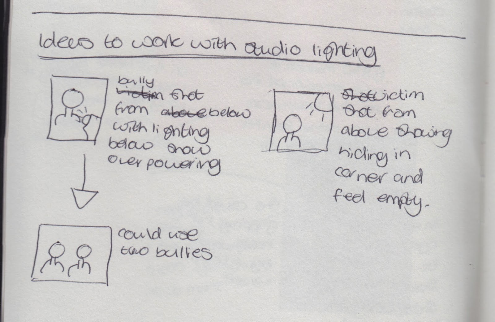
For this idea I want to work with lighting and angles. The different ways of shooting people to convey a variety of emotions. On the left is a quick sketch of some ideas concerning these photographs.


Thursday, 20 March 2014

Experimentation - Working with Words

From my illustration I found playng with fonts very interesting, which led me to think how I can play with words. I create a 'wordle' style A4 image and then printed it a and played around with paint, ripping and projecting. The image on the left is the original.


For this image I used a light brown/orange water paint colour over the backdrop then selected a few colours and coloured over certain words/phrases which stood out to me.
I could develop this by possibly burning the edges.
For this image I covered it in a water colour blue and then placed more and more water over it to make it wet. When it was wet I scrunched it up and this mad it have a crying effect.
From this experiment I found that by working with a printed image, covering it in water and scrunching it up gave it the effect of being tear stained. I could work with this more and possibly create tear stains on a printed image.
For this image I did a monoprint. I did this purely for an experiment, I have previously done a monoprint and I thought it looked nice and wanted to investgate the effect it gave if I did it on a bunch of text. The text didn't look very different as a monoprint and didn't change much.
I don't really like this ideas, it isn't great for my theme and concept.


Taking the words I projected them onto the face of a model. I added water under the models eyes to give
the illusion of her crying.


This was my final edited image. I worked with overlaying white on the face to make it look more pale and possibly resemble death. I found that the words didn't read very well on the face and that I needed to make the words clearer. I could make the words smaller on the face and use a projector closer to the face. to try and ensure the words aren't blurred.
I think I could develop this idea by possibly working on a bigger part of the body - perhaps the back - and project the story of someones bullying victimisation onto their back to be read. I could also project a group of pictures which  show the growth and evolution of bullying. Below is a quick sketch I drew of this idea.