
In order for this to work I thought I could create a wordle document displaying a variety of words which explain the way to victim feels. I then will print this onto acetate and then turn it into another photogram. I will do a additionally photogram which is just of my hand then in Photoshop I will overlay them.
 I pinpointed certain words and phrases from the Dairies of a Bully Victim which stood out to me to display the feelings of a victim of bullying. I printed this onto to acetate ready to take into the dark room.
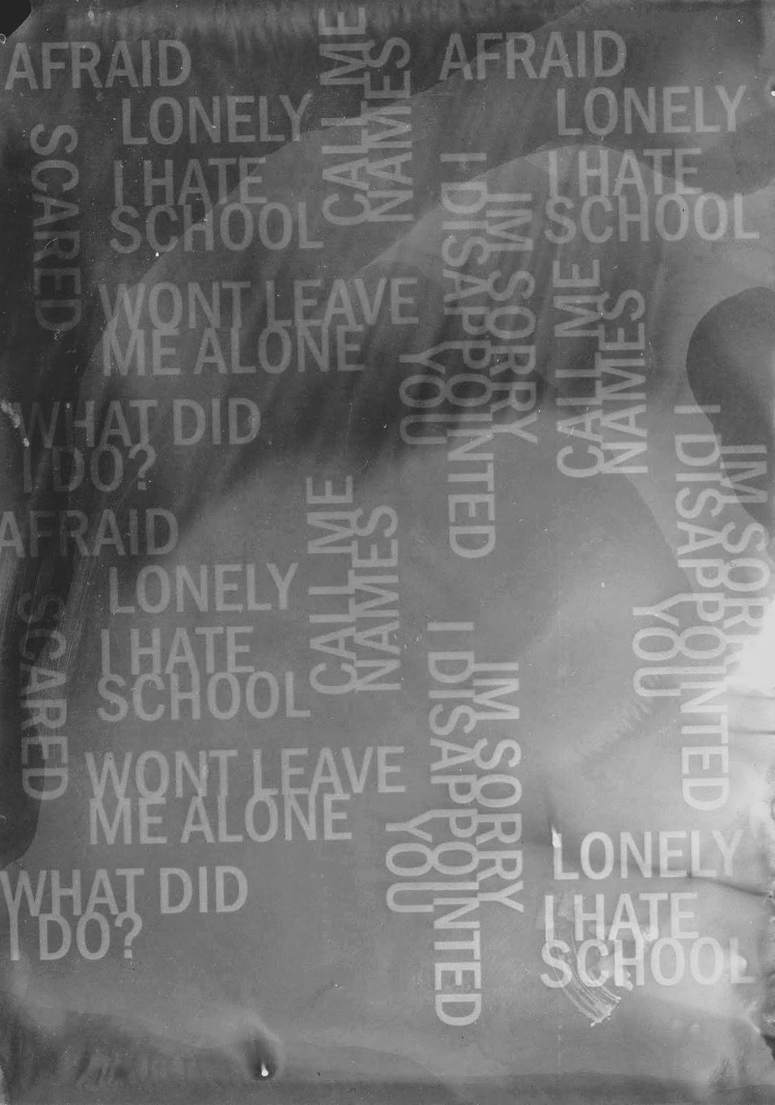
I pinpointed certain words and phrases from the Dairies of a Bully Victim which stood out to me to display the feelings of a victim of bullying. I printed this onto to acetate ready to take into the dark room.Photograms
 This first photogram I placed the words upside down and onto the photo emulation paper. I then placed glass over the top to hold it all down and then shone the light on it for 5 seconds.
I found this was very grey and I wanted it to contrast well I wanted the words to be white and the rest to be black. Therefore this one wasn't usable for my idea. However, I did learn that I needed to changed the developer to try and get a darker image so changed that a tried again.

Below is the Photoshoped image:


Both of these hands were good. However the right one has more white marks init where the hand was pressed down firmer on the photopaper. Therefore when I overlay the two images it may work better for this photogram. However, they are both very similar so I want to try overlaying with both images.


From the above photograms I found the second one is better. However, it's not very emotional I feel there should be some colour added in to give it more emotion. The first one (on the left) is plain and very simple. There isn't a lot of contrasts within the image and this make sit dull. The words don't stand out enough which I don't like. I could work with the second one by adding colour to the words through overlaying paintbrushes.
 To enhance this image I overlaid a blue gradient as I feel blue is an important colour as it represents water and therefore tears. I feel the colour blue can emit emotions of sadness and I want to try and manipulate the viewers of my work to see it as emotional and sad. However, I feel this is not as emotional and as interesting as the work I want to produce. I don't feel this media is the most appropriate for my own ideas however I could look further into the use of words and how words can play a role in bullying. The power of words as well is good and the development of colours can mirror how bullying can develop overtime. I could look into working with colours and the power of colours. Below is a colour chart which I made based on this idea using bright colours developing to dark:
No comments:
Post a Comment